
A mobile-friendly website is one that reads and works properly on a phone without pinching, zooming, or scrolling sideways. Text is legible at its normal size, buttons are big enough to tap with a thumb, the layout fits the screen, pages load quickly on a cellular connection, and the phone version carries the same content as the desktop version.
Picture someone standing on the sand at Main Beach on Amelia Island late on a July afternoon, deciding where to eat. They search, tap a local result, and the page arrives as a shrunken copy of a desktop site. The menu text is the size of ant tracks. The phone number sits in a footer they have to hunt for, and two links are packed so close that their thumb hits the wrong one. The easy move from there is the back button and the next result. That moment is what the term describes.
What does it mean to be mobile friendly?
Being mobile friendly means a visitor on a phone can read your site, move around it, and contact you using only a thumb, with nothing to zoom and nothing hidden past the edge of the screen.
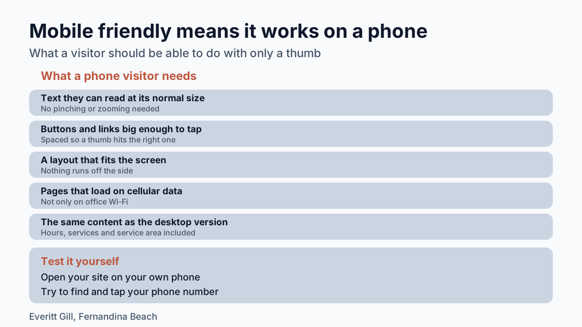
A phone user judges that in seconds, and these are the things they notice:
- Text that is readable at the size it loads.
- Buttons and links spaced far enough apart to tap accurately with a finger.
- A layout and images that shrink or stack to fit a narrow screen, so nothing runs off the side.
- Pages that load quickly on cellular data, not only on office Wi-Fi.
- A phone number that opens the dialer and an address that opens the map when tapped.
- The same information the desktop version has, with no "view full site" link needed to find it.
A common technical reason a page fails the first item is a missing line of code called the viewport meta tag. It tells a phone's browser to fit the page to the device's actual width. Without it, phones render the page at a typical desktop width and scale it down, which produces exactly the ant-sized text from the beach example.
Why does Google care whether a site works on a phone?
Google cares because it uses the mobile version of a site's content, crawled with a smartphone agent, to index and rank pages, a system called mobile-first indexing.
That flips an old habit. A lot of owners still review their website on a laptop and judge it there. For search, the phone version is the one Google reads.
It also explains why trimming the mobile page to save space backfires. If the phone layout drops your hours, your list of service areas, or the paragraph about weekend appointments, Google advises that the mobile site should contain the same content as the desktop site. For a business whose customers search from a boat ramp or a grocery store parking lot, the paragraph that got cut may be the one that answered their question.
No setup guarantees a ranking. A site that works on a phone removes one obstacle between a searcher and your page, and it hands Google the full content to read.
How to make a page mobile friendly?
The standard way to make a page mobile friendly is responsive design, where the page serves the same HTML code on the same URL to every device and rearranges how it displays based on screen size.
One page, one address, and a layout that adapts. In practice the work looks like this:
- Add the viewport meta tag to the head of every page.
- Build the layout with flexible widths, so a three-column desktop row stacks into one column on a phone.
- Size images for the screen showing them, so a phone is not downloading a photo meant for a 27-inch monitor.
- Make the call button and contact form large and easy to reach with a thumb.
- Keep everything from the desktop version on mobile, even if some of it sits behind an expandable section.
- Test on an actual phone, on cellular data, outdoors.
That last step matters on the coast. Light gray text on a white background can look elegant on a monitor indoors and vanish in afternoon sun on a dock, which is where a fishing guide's or a kayak outfitter's customers often are when they look them up.
Retrofitting an older fixed-width site can turn into a rebuild, because the layout itself assumes a wide screen. That is where a developer earns the fee: the content, domain, and address can stay while the structure underneath is rebuilt to flex. Everitt Gill designs, builds, and hosts websites for small local businesses in Fernandina Beach and across Northeast Florida, with layouts built to fit a phone screen from the start.
How can you tell if your own site is mobile friendly?
You can tell by opening your site on your own phone and trying to do what a new customer would do, without zooming or turning the phone sideways.
Run through a short test:
- Can you read the first screen without spreading two fingers?
- Can you find and tap your phone number in one move?
- Does any part of the page scroll sideways?
- Are your hours, services, and service area all there, or only on the desktop version?
- Does the page load before you lose patience on cellular data, not just on home Wi-Fi?
If any answer is no, the fix is usually in the template rather than in the words, and that is a job a web developer can scope quickly once they see the site on a phone.
What does it mean for a website to be user-friendly?
A user-friendly website lets a visitor find what they came for and act on it without having to think about the site itself.
Mobile friendliness is one piece of that. The rest is plain labeling ("Services" instead of a clever menu name), contact details on every page, short paragraphs, and pages that answer the questions customers ask on the phone. Imagine a pressure-washing company serving Yulee and the island. A user-friendly site for that business lists the neighborhoods it covers, shows what a driveway looks like before and after, and puts a tap-to-call button where a thumb lands. A simpler phrase for user-friendly is easy to use, and that is a fair standard to hold any small business site to.
Before a noun, both terms take a hyphen: a user-friendly site, a mobile-friendly menu.
A site that passes on a phone usually passes everywhere else, because a phone is the hardest screen to design for. Start there, and the desktop version tends to take care of itself.
Frequently asked questions
What's another way to say "user-friendly"?
The plainest substitute is "easy to use." For a website, that means a visitor can find what they came for and act on it, such as calling or booking, without having to figure out the site first.
Is a mobile-friendly site the same as a responsive site?
Responsive design is the standard way to make a site mobile friendly. A responsive page serves the same HTML at the same URL to every device and changes how it displays based on screen size; mobile friendly describes the result a phone user sees.
Does a mobile-friendly website guarantee better Google rankings?
No setup guarantees a ranking. Google uses the mobile version of a site's content for indexing and ranking, so a site that works well on a phone removes an obstacle and gives Google the full content to read.
What is a viewport meta tag?
It is a line of code in a page's head that tells a phone's browser to fit the page to the device's actual width. Without it, phones render the page at a typical desktop width and scale it down, which makes text hard to read.