The web design principles and best practices that matter most are the ones you can check: design for phones first, since Google indexes the mobile version of a site; meet Core Web Vitals speed thresholds; follow WCAG accessibility guidelines; stick to familiar conventions; and cut anything that competes with what visitors came for.
Picture a family in a rental cottage on Amelia Island on a July afternoon. The air conditioner has quit, and they are searching on one phone for someone who can come today. They will give each business's site a few seconds. If the phone number is buried under a slideshow, or the page jumps while it loads and they tap the wrong thing, they go back to the results and call the next name. Everything below is about winning those few seconds, and most of it can be measured instead of argued about.
What is the first rule of web design?
The first rule of web design, in my view, is to build for the phone first, because Google uses the mobile version of a site's content for indexing and ranking.
Google calls this mobile-first indexing, and it crawls that mobile version with its smartphone agent. So if your desktop site is polished and the phone version is cramped, or hides the services page behind a menu nobody opens, the cramped version is the one being judged.
Designing phone-first changes the order of decisions. The tap-to-call button, the hours and the service area go near the top of the small screen. The wide desktop layout gets built out from there, instead of squeezed down afterward.
What are the 7 principles of web design?
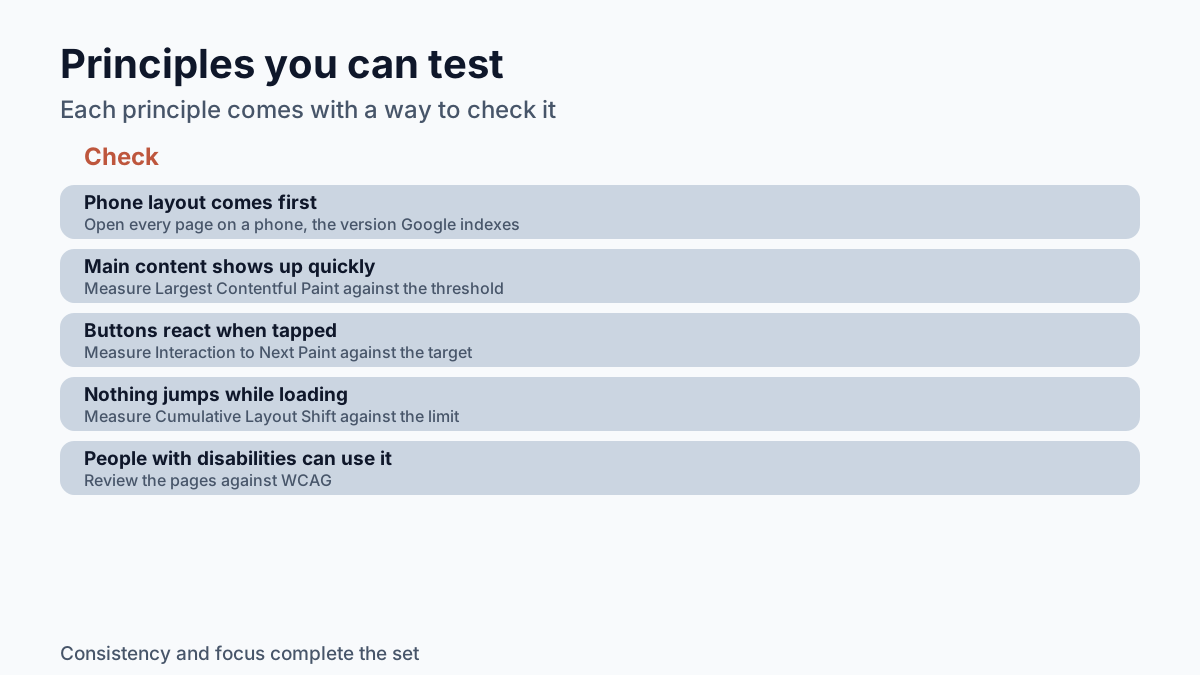
A useful set of seven web design principles is mobile-first layout, fast loading, quick response to taps, a stable layout, accessibility, consistency and focus, and each one can be tested.
| Principle | What it means | How to check it |
|---|---|---|
| Mobile-first | The phone layout is designed first | Open every page on a phone; that is the version Google indexes |
| Fast loading | The main content shows up quickly | Largest Contentful Paint within 2.5 seconds |
| Quick response | Buttons react when tapped | Interaction to Next Paint of 200 milliseconds or less |
| Stable layout | Nothing jumps while the page loads | Cumulative Layout Shift of 0.1 or less |
| Accessible | People with disabilities can use it | Review against WCAG |
| Consistent | Same words and patterns on every page | Labels and menus match from page to page |
| Focused | Nothing crowds out the main task | A stranger finds your phone number in seconds |
The number seven is a convenience. What makes the list useful is the right-hand column.
How fast does a website need to be?
A website is fast enough when it meets the three Core Web Vitals thresholds: main content visible within 2.5 seconds, a response to taps in 200 milliseconds or less, and a layout shift score of 0.1 or less.
Each number measures something a visitor feels. Largest Contentful Paint (LCP) is the moment the biggest piece of content, often the headline or main photo, appears, and a good score is LCP within 2.5 seconds of the page starting to load. Interaction to Next Paint (INP) measures the lag between a tap and the screen reacting, and the target is 200 milliseconds or less. Cumulative Layout Shift (CLS) scores how much the page jumps around as it loads; 0.1 or less is good.
The catch is how they are measured. The thresholds apply at the 75th percentile of page loads, segmented across mobile and desktop. In plain terms, three out of four visits have to hit the mark, including the one from a phone on a cell connection in the parking lot at Main Beach, not only the one from your office Wi-Fi.
When a small-business site misses these numbers, the causes I check first are oversized photos, piles of add-on scripts and underpowered hosting. A capable developer sizes images for the screen, keeps scripts lean and hosts the site somewhere that can serve it quickly. That work is invisible when it is done well.
Why does accessibility belong in web design?
Accessibility belongs in web design because a site people with disabilities cannot use turns those customers away, and the Web Content Accessibility Guidelines (WCAG) explain how to make web content more accessible to them.
In practice that means text with enough contrast to read, descriptions on images for screen readers, buttons big enough to hit with a thumb, form fields with clear labels, and pages that work without a mouse. Much of it helps everyone. Pale gray text on white washes out in bright Florida sun on any screen, whoever is holding the phone.
What are the best practices in web development?
Two usability rules from Nielsen Norman Group hold up across nearly every site: follow familiar conventions so visitors never have to guess what something means, and remove anything that competes with what they came to do.
The first comes from the group's ten usability heuristics: "Users should not have to wonder whether different words, situations, or actions mean the same thing. Follow platform and industry conventions." If the menu says "Services" on one page and "What We Do" on the next, a visitor wonders whether those are two different pages. Put the logo top left, link it to the home page, and call things by the same name everywhere.
The second rule is about restraint. The same usability heuristics put it this way: "Every extra unit of information in an interface competes with the relevant units of information and diminishes their relative visibility." Imagine a fishing charter's home page with a tide chart widget, a social media feed, a rotating slideshow, a newsletter pop-up and, somewhere below all of it, a "Book a trip" button. Each piece makes sense alone. Together they bury the one thing the owner needs a visitor to do. Deciding what stays off the page is part of the designer's job.
What are the 7 steps in web design?
A web design project can be run in seven steps: set the goal, gather the content, plan the page structure, design the phone layout, build, test against the standards above, and launch with a plan for updates.
- Goal: decide what a visitor should do, such as call, book or request a quote.
- Content: collect services, hours, photos and service area before design starts.
- Structure: map the pages and the menu so every page is two taps from home.
- Phone layout: design the small screen first, then widen it for desktop.
- Build: write the pages, with images sized for the screens that will show them.
- Test: check Core Web Vitals, run through accessibility issues, and try every page on an actual phone.
- Launch and maintain: confirm who owns the domain and hosting, and who updates hours and prices.
Two tools carry most of steps 5 and 6: a code editor for writing the site and the browser's built-in developer tools for inspecting it, including on a simulated phone screen.
What skills must a web designer have?
A web designer needs to lay out pages for small screens, write clean HTML and CSS, measure speed and accessibility, write plain copy, and explain hosting and domain ownership in terms an owner understands.
That last skill gets overlooked. Owners often find out years later that they do not control their own domain, so ask about it before any work starts. Ask, too, how the designer tests speed and how they handle updates after launch. Clear answers to those questions tell you more than a portfolio of desktop screenshots.
I design, build and host websites for small local businesses in Fernandina Beach, Amelia Island and Northeast Florida. If you want a site built around the checks in this post, a website quote from Everitt Gill is the place to start.
Frequently asked questions
Does Google rank the desktop or the mobile version of my website?
Google uses the mobile version of a site's content, crawled with its smartphone agent, for indexing and ranking. This is called mobile-first indexing, so a weak phone version is the one that gets judged.
What is a good Largest Contentful Paint time?
A good Largest Contentful Paint happens within 2.5 seconds of the page starting to load. Core Web Vitals thresholds are measured at the 75th percentile of page loads, across mobile and desktop.
What are two tools every web developer needs?
A code editor for writing the site and the browser's built-in developer tools for inspecting it, including on a simulated phone screen. Testing on an actual phone is still worth adding.
Is a simpler home page better for a small business?
Usually, yes. Nielsen Norman Group's usability heuristics say irrelevant or rarely needed information competes with the relevant information and lowers its visibility, so extra widgets can bury the button you most need visitors to tap.
Sources reviewed
- Google Search Central: mobile-first indexing Google uses the mobile version of a site's content, crawled with the smartphone agent, for indexing and ranking.
- web.dev: Core Web Vitals A good Largest Contentful Paint is within 2.5 seconds of when the page starts loading.
- W3C WAI: WCAG overview WCAG documents explain how to make web content more accessible to people with disabilities.